Sunday, February 27, 2022

Dialogue and Film Prep

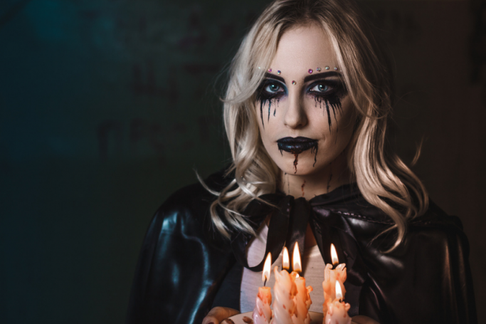
 While it's still a hard time for me, I'm trying to get back into the swing of things. I figure this project will be a good way for me to take my mind off of things, and not sink down into the doldrums of anguish and despair. Poetry aside, let's get into the good stuff.

THE SCRIPT:


~~~~~~~~~~~~~~~~~~~~~~~~~~~~~~~~~~~~~~~~~~~~~~~~~~~~~~~~~~~~~~~~~~~~~~~~~~~~~~

TRAILER #1


Scene in Car


Steve

We’re almost here


Scene in Front of House


Steve

That’s our house. Pleasant, like the town.


Val

It’s marvelous! Say, is this place new? I’ve been trying to read up on it before we left. Looked it up online, everything. Didn’t really find anything on it.


Steve

Sure, I guess it’s relatively new. Just don’t focus so much on the ghost stories you read up on. (Val looks sheepish - Steve light chuckle) 


Val

After everything we’ve been through, I… I just want things to be perfect for us.


Steve

It’s already perfect, we’re pretty much in paradise! Now come on inside.


Friendly Neighbor

Hey new neighbors, pleasure to finally meet you!


Montage of Tranquil Shots

Val and Steve dancing in front of record player


Val

I think we’re finally home.


Scene Later with Val and Steve at House After TC Incident


Val

(Panicked)There’s something not right with this town.


Steve

(Much more robotic) This is our forever home, isn’t it. (darkly) We’re not leaving.


Scene of Val in Car Trying to Leave


Friendly Neighbor

Leaving so soon? (Voiceover recording) No one ever leaves this town.


Scene at Park With Sigma in Shadows


Val

(Shouting  panicked) Who are you?


Scene of Val Shaking Door


Val

WHY IS THIS HAPPENING TO ME?!!!


Scene of Sigma in House


Sigma

With all of the terrible things you’ve done to get here, you were already almost a demon anyway. It was you who wanted to escape your family, escape your town, escape yourself. I’ve given you a way to do just that! Now, you get to spend eternity in PARADISE!!! 


(Voice over fading black) Tell me….. Did you really think you could ever escape yourself?

~~~~~~~~~~~~~~~~~~~~~~~~~~~~~~~~~~~~~~~~~~~~~~~~~~~~~~~~~~~~~~~~~~~~~~~~~~~~~~~

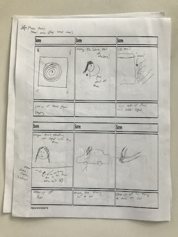
I figure I'll just put the script for the first trailer here. It's the trailer where I'm going to utilize more dialogue anyways, so it's probably the better one to include. I do want to touch up some of the lines in the second trailer, so I might just put my final draft of that one in a later blog post. 

Now, to dissect this one. I want the tone and cadence of the opening scenes to almost resemble that of a sitcom. The couple finally moving into their new house, the wife overjoyed, the husband proud, etc. etc. I did add some extra bits of dialogue in the scene where the pair are standing in front of their house that I know I'm probably not going to use, but I wanted to see if I could add just a note of suspense during that sequence. Just to make it into an easier transition into the thriller part of the trailer. Or I'll just cross out a few of those lines. I want the pace of this trailer to start off slow, and then quickly pick up. But, I worry that those few extra lines will really mess with that pacing in the beginning and won't allow for a smooth transition. 

I'll most likely play around with the dialogue while filming. The last trailer project that our class did, I made up some of the scene dialogue on the spot, just because the script was finally read out loud and I didn't like how stiff some of it was. It's always hard to write dialogue, it's apparently one of the most difficult part of pre-production to get right. But, I like what I have for this trailer at this moment, and it's safe to say this is my final draft and what I'll be working with for the duration of filming.

Film Prep!

I'm just about ready to start filming and it feels good. I'm trying to give myself as much time as possible for editing and the other components of my project, so hopefully I'm keeping at a good pace.

I have to work out some of my settings. I already have my settings list ready (I'll put it right down here):

-Town Center

-My house

-The plaza

-Markham Park

-Everglades bike trail


I just have to decide if Markham Park would be the best choice, or if I could just film at a park that's a little closer. 


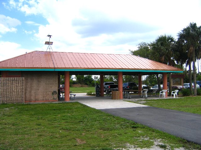
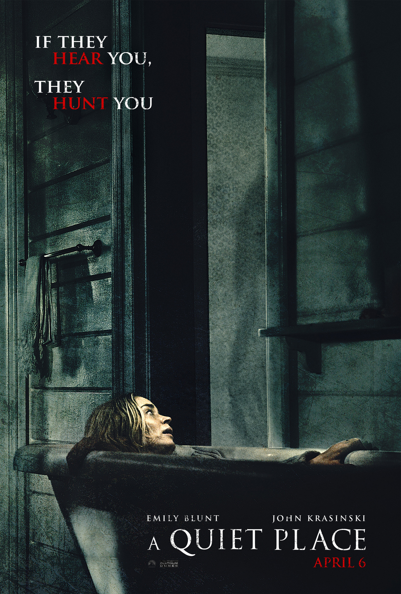
This is Markham, and it works well for the shots I want to get. But, I just worry about how crowded it will be. I'm going to go later, when its darker, just for the thriller shots. The lighting is something that's gonna be crucial, but I do have a plan for it. My main concern remains how packed the park will be. I'm hoping that nobody wants to go to a park when it's darker out. Even if it is Markham. I do have a contingency plan, and that usually is not crowded. So all in all, I think I should be fine. Catch y'all next blog post.


One last thing:


Saturday, February 26, 2022

Для майбутнього

There's something I want to address before I go into the topic of my blog post. I'm debating right now whether to even go into what I had planned. While I do enjoy writing these blogs and I've enjoyed working on my project (I'm excited to start filming next week), there's something far more important and astronomical that has happened over the course of this week. The Russian invasion of my birth country has impacted my family heavily. It was one of the worst days of my life so far, and the most emotionally confusing by far. I cannot stress enough how terrified I am about the situation, and also just how strong my patriotic zeal has gotten. I just want to praise all the brave people fighting for freedom at the moment, including my family. They're not planning on evacuating, and some are even fighting in one of the most heavily shelled cities at the moment: Kharkiv. I just want to show my full support behind this cause, and make people aware of just how bad this situation is. And just how proud I am of the way my country is standing up for itself. My old school there had a motto: "No quit". Period. And just a little film tie-in here, Sean Penn is there at the moment filming a documentary. Hopefully that will capture what's really happening there, and just how resilient the people really are. I could never have imagined this happening to the land of wheat and sunflowers, but it has. And if I'm a little... off... in the coming days, this is why. I still haven't fully processed this, but I'll try my best to move forward. 


In any case, 

Cлава Yкраїні!

"Glory to Ukraine"


Here's some cool photos of monuments lit in the colors of the Ukrainian flag:


I'm deciding that I will get into some of my final project stuff in this blog. I'm just going to ease into it, and just put more in my next post. 

So, here's my character costume design ideas for Sigma:


My main inspiration is the costume design behind this Netflix show's namesake: Lucifer. I really want Sigma to have that dapper look, to a point where it's a little ominous. I also want to show the power that Sigma has in the town, and wearing a suit or fancier dress shirt seems like a good way to get that across. I want the suit or dress-shirt to be black or dark blue, just so Sigma seems as though he is enveloped in a constant shadow. It would also work well when I want to use editing techniques to make Sigma appear behind Val seemingly out of thin air. I do want to add a little bit of color, so maybe a red accessory, just to promote his demon status and have some accent whenever he appears in flashing lighting. It would also be symbolic of him being a walking red flag. 


This is close to what I want for makeup design. Just to have some shadows around the eyes, maybe use some eyeliner to put in line dark veins around the eyes as well. I won't have the bloody lips, but I might try to make Sigma look more pale and unnatural. The makeup design could be even more simplistic than this, just depends on how threatening Sigma looks in the costume alone.

And yes, you did hear me right: I'm planning on starting to film next week. I might even try to get some shots soon, just blocking and working out camera angles and potential inserts at my chosen locations. I also have to work out the lighting a bit, so next week could be more of a tinkering period than the actual final shots that will go into my trailers. I'm also planning on working on my poster next week, once I take a good image of my lead and work out some mirror shots.

One last thing before I go:


Translation results

Thursday, February 24, 2022

Lights, Fake Blood, Costumes!

I want to get into the miss-en-scene elements of my trailers now that I have my storyboards done and I pretty much have an outline of what I'm doing for both trailers. And yes, I do need the fake blood. Psychological thrillers typically do have blood, and plus, I feel like just making fake blood would be fun. So I'm doing it. 

I found a great Variety article with a Special Effects Artists that includes a video detailing how he makes fake blood here. He uses basic supplies that I already have, and I would really only need to stock up on the food coloring. He also details the different kinds of blood and how to mix it so it can stay on the skin better and really cake the skin. Now I know that I can just add a little bit more yellow food coloring to make the blood appear like it's a freshly cut wound, and add in brown if I want it to look like it came from a deep artery. Apparently soap is great at getting the fake blood to that perfect texture and helping it stay on the skin, which I didn't know. 

Just so I don't forget, the ingredients for it are:

-1/4 cup corn syrup 

-1/4 tsp red food coloring

-1/2 tbsp cocoa powder                                     

-distilled water                                                                 

-drop of green food coloring

-drop of blue food coloring

-1/2 tsp corn starch

-5 pumps hand soap


I might also have to buy some black food coloring. For the close-up shot of the blood running down the arms, I wanted that blood to be black to symbolize Val's transformation from human to demon. I'll still probably use the red blood as well. Actually, it might work great with that scene of Val's husband Steve in front of the tv after he's been "turned". There could just be a small amount of blood dripping down his head that could make the shot just a little bit more disturbing and creepy. And it could work great with that shot of Steve grabbing Val's arm as she's reaching for the door handle. The blood could drip down his arm, with the lights flashing and everything. Yeah, that might work great. 

Lights!

I also want to work on my lighting scheme. Again, the thrillers that I studied all had a particular light motif. It is conventional for psychological thrillers to play with lighting and that contrast between light and dark, so I want to get this right. 


This was a great little tutorial. Although this was more focused on horror, I definitely picked up some things I could use for my thriller. I want to have more of that shadow effect, especially for some scenes with Val and Sigma. I also learned not to just settle on the first light choice: that it might be better to change it up a little bit or to even remove or add some light to the scene. Considering I'll be filming a lot of scenes more in the dark, I'll have to start finding some interesting light sources already. I want to see if I can use an object to create suspense as well. It may not be a bush, but I do want something covering Sigma at some points, just so the character can be even creepier at times because not all of him/her is revealed at once. 

And though this video didn't explicitly mention it, I also picked up some other things besides lighting design. I found that there was some sort of movement in almost every shot, whether it be the waves in the pool or the slight blowing of the bush, or even the movement of the light. It creates more suspense to have that movement, and it never lets a shot of still, which is something I want to use for my trailer. I also found that the sound design was important and creating suspense. Whether it was the sound of the wind or the splashing in the pool, it was never really that quiet. I also think that I can make some parts of my trailer more quiet, and then hit the audience with a black fade-out transition before going to a creepy shot. It also depends on the background music I put in as well, since that could add the suspense element for my trailers early on.


Costume Design:

Unfortunately, there will be no demon outfits for my two trailers. I want them to seem like normal townspeople, so there won't be anything crazy supernatural that I'll have to design. I will have to figure out makeup, especially for Val and Sigma, but I'll get into that later. For right now, give it up for conventional husband Steve and his potential costume design:


I want that old-fashioned look for both Steve especially. The typical button-down white shirt with the belt and jeans. It would fit in well with the idea of the perfect suburbia and might create an even more forbidding tone because this is taking place in the current time period. The asynchrony adds another level to the thriller.

For Val:


I was thinking she could have an older-looking dress. If I can't find something suitable, it could be more modern. I just want a part of her costume to include red, whether it's the dress itself or an accessory, just to act as a warning signal. Or, I could stick with color theory and pick something that would not mesh well with green (symbolizing the struggle between Val and the town). I was thinking blue would be another good option.


I was thinking of doing something similar to the makeup look above for Sigma and when Val starts turning into a demon. It doesn't have to be as extreme as this, but I did want to put shadow around the eyes and maybe use eyeliner to put in some dark veins around the eyes or even mouth.

For Sigma, you'll just have to see my next blog post. I'll probably talk more about my setting and plan out more of the rise-en-scene design a little more. Until next time.

Wednesday, February 23, 2022

More Storyboarding (Because 2 Trailers!!!)

So, I did manage to finish up the storyboard for the second trailer. I didn't just want it to be a rehash of the first, but I will use some of the shots from the original trailer, just because movies often do. Before I show the trailer, I want to give myself a round of applause for actually getting something done during a holiday:


This was my actual face after I was done storyboarding. Then I took a power nap. In any case, here's all that hard work that I've been lauding myself for (once again, excuse the poor doodling skills):


This trailer is going to have a lot less of that peaceful and tranquil beginning. I want to almost jump in with that suspense, maybe not right from the get-go, but right when the couple are moving in to their new home. Having more eerie music pick up, along with the dialogue, could make the pacing of this trailer even faster. I might also use the record player shot as the transition into the actual thriller part of the trailer, I just haven't added it to the storyboard yet. Actually, never mind. It doesn't relate to this trailer as much because there has already been a creepiness kick from the score. And the shot of the couple dancing in front of the record player doesn't fit in as well, and I really don't need it. 

For the audio, I plan to include a lot more dialogue to progress through the trailer as well. This will probably make editing more of a pain, but whatever. It doesn't have to be seamless, especially considering my skill and experience level. I'm also planning on this trailer being darker, so I'll try to figure out good lighting techniques (I also want to figure out a lighting motif, whether it's neon or rustic lighting, or anything). I might add in more brightly lit shots, I might not. I'm also planning on revealing more about Val, and her past crimes (the reason she is in the town and trapped by demons in the first place). There will also be more Sigma (head honcho demon, if you couldn't remember). Which means I have to figure out a character design for him/her (depends on the casting). I still want that same level of shot variety, and there will be more shaky camera movement. 

This also has a slightly different trailer format. Rather than just having it be the blackout fade edits to transition between shots, I thought that I could use some text. I wanted to only have it in the beginning half of the trailer, just because I know the pace would be slowed by it, and it seems more like something to build tension rather than included in the climax. I wouldn't want to break up the creepy shot montage with some corny text. I don't want it to be corny, but there is a large grey area and the line into cheesy could be crossed. I know that it's a convention of thriller trailers, and Last Night in Soho manages it well with the editing, but it could be too much of a risk. I still have to think about this, and I know this won't get resolved until the post-production process when I can actually see the tangible product and decide whether to omit it. Again, this is not something that I have to decide now. I still have to play with the text I'm using anyway, because I am far from confident with what I have now. Eh, I'm fine. I'm liking my progress so far, and now that I have my storyboarding done, my main focus is who I'm going to cast. I'll let y'all know what I come up with, and I should have more stuff to share soon.


For those that can't read it:
-What would you give...
-To live in paradise?
Break for a few sequences
-Just don't let the past
-catch up to you


Friday, February 18, 2022

Storyboarding!!!

This is probably my favorite part of the pre-production process. I'm terrible at drawing - as you'll see - but I like to manifest my ideas on a piece of paper. And scribbles are a pretty good way of doing it. I only have the storyboard done for one trailer, but I'll include some of these shots in the second trailer, and I do have some miscellaneous creepy shots on here that are extra - just in case I need it:

Post pictures of storyboard here:


I really wanted to have that juxtaposition in this trailer. The beginning will be oversaturated and colorful, as I really want my setting to seem like a suburban paradise. And the town that I'm in will work very well for that. I might have to use a LUT, but I doubt that it's going to be needed. And I want to have plenty of long and wide shots to capture the setting. I won't use all, of course, but I want to be able to choose a good one from the selection. The setting is going to be a very important symbol in my piece, so I want it to be highlighted by a good shot. 

I want my characters to almost seem like a stereotypical couple from the 1950s or '60s. I'll have to work on my costume design - I already have a couple of ideas for Val and her husband (who's yet to be named, so I'll work on that, too). I'll most likely have Val wear a colorful dress that is reminiscent of something from the '50s or '60s. And the husband will wear something conventional of a working husband. I want that appearance of an average family. I want Val to wear something that suggests she is not what she seems. Maybe a color that doesn't match or isn't compatible with the others. And I'll utilize the two-shot to really sell that family ideal. Their dialogue will also serve as great context, which just reminds me... I still have to write the script. Anyways, my favorite of the two shots is the one that I want to capture of the couple dancing in front of the record player. Just to really get that "life in paradise" vibe. Well, before the demons are revealed. 

For a transition shot, I want to use a wide shot of the sun setting. In Florida, it's absolutely beautiful, but it also gets really dark after the colors drain from the sky. I want to use that image of the colors being drained and darkness taking over for, well, you know. That, coupled with an edit to pure black and some chilling music kicking in, would make the tone do a complete 180 degrees and pump in that thriller genre. 

I just worry that the tranquil and picturesque part of the trailer would go on a bit long. I want it to be at most half of the trailer, maybe going to the one minute mark, but I just don't know if that would be dragging on a bit. I could infuse some creepier shots. Maybe hint at the change a little. I'll have to work it out, since this is the roughest draft possible, but I do know that I want to add some more gruesome horror shots. I feel like those work well for the psychological thriller genre. Especially towards the ends of the trailers, just to hook my target audience. It's a trailer convention for the genre, and I have to say that it works well. Maybe have the title pop in after a period of prolonged silence (maybe after a shrill scream or another thriller sting). The credits would appear quickly, and the font could be a pure white, and I want it to remind me of a broken white-picket fence (like for the poster). 

I don't know what's next on the blog posting agenda, but I'm looking forward to it. Hopefully I'll have the script ready for y'all by the next post.

Thursday, February 17, 2022

The Rough (and I Mean Rough) Draft of My Poster

Now I want to talk about my poster in all of its glory. I just want to dedicate a whole post to it, just so I could explain my thoughts and work on this rough rough draft while I'm typing this up. Oh, and I still haven't explained the movie idea.

Alright, so, the plot is focused on this character called Val. Val moves to this seemingly perfect town with her seemingly perfect husband. The two have to adjust to this new life, but find it easy. However, it is too perfect. They quickly notice that there are some things wrong with this town. The people are... off, in a way. They sometimes seem too robotic, following programming and not behaving like humans. Val tries to get to the underbelly of the town by going to the Pleasantville Town Square. There, she notices some strange behavior from some of the residents. They try to hunt her down, and are revealed not to be human, but in fact demons. From there, she goes to the Memory Graveyard on the outskirts of town. Instead of bodies, she finds the belongings of the people who have been hollowed out before her by the demons that run the town. These include photos, cameras, etc. She tries to flee the town, but then notices that her husband has been acting strange as well. Her husband and their neighbor try to prevent her from leaving, but she escapes. But, she is unable to evade the demon that is in charge of this town operation. The demon, known only by the name Sigma, reveals to the audience that Val (who could be referred to as an unreliable narrator) has been lying about being completely innocent this whole time. She has committed some serious crimes in her past, including accidental murder, and now has to pay for it. Sigma also speeds up Val's hollowing out process, and she starts noticing that she is becoming more like a demon after making one last attempt at fleeing. Sigma watches with a sardonic smile as Val fails to get past the borders of the town. She is left to her own misery as she finally completes her transformation and the demon inside of her has been released. The movie ends with another couple moving to the town of perfect houses and white-picket fences, this time with Val to greet them as their friendly next door neighbor, all of her humanity gone.


Now that we have gotten the plot out of the way, let's see that poster again:
-Made using Canva


Again, I'm just really proud of how absolutely creepy this turned out. I hope this bodes well for the final product, because I kind of want to make that even more unsettling. And it is a psychological thriller, so I'd just be doing something that attracts more of my target audience. 

So, to talk about the actual features of the poster, I want to make it clear that I am not going to include the cartoon person in the actual poster. This is simply a placeholder until I get an actress for the role (or maybe even do it myself, who knows?). But for right now, this is it. I also am going to add that demon face to my actual poster, to represent the transformation. Same with the cracks on half of the mirror. I may even have it on the entirety of the mirror, I'm not sure yet. I just want to make sure that I blend it well, so it doesn't become choppy. I also like the little lights that I added. It gives it a little more pop and frames it better. It also reminds of the lighting scheme that I want to have and how lights play a role in my production (the summoners of the demons, or something like that). I also like my black background. The lights and the bright mirror contrast against it well, and creates that symbol of a bright facade covering darkness. Again, referring back to the would-be central theme of the actual film. And I could choose either one of two routes to make it better: either blend it in more, and make it seem like the darkness is trying to swallow the mirror. Or, I could embrace that contrast and make it appear even more separated from the black background. These are things that I have to keep in mind later.

Now, about that format: I don't like the title up at the top. I do think that it works better down at the bottom of the mirror. Now that I've gotten that out of the way, I have to explain the format that I want the poster in (what would work best for marketing). I've decided - for now - that I want it in that digital format, since I'll probably distribute it more with digital streaming services and do more social media marketing for it, so having a digital poster would be more convenient and suitable. That means I won't include credits next to the title at the bottom, just the date of release (and maybe in a bold red).

Font:
This is a big one. Fonts are the thing that I'm least comfortable with and often have the most strife with. They just don't like me. I can never find the one, if you know what I'm talking about. And there are always a lot of options, but they're never really great or even a good fit. As is the case with this poster, where I've only found ones that could work if need be. That's why there's two titles, by the way. 


Font: Playfair Display Black

I like this font because it has that tight, important feel to it. It is stressing its seriousness, if that makes sense. I also wanted to have a font that reminded of perfectly straight white-picket fences, and this has that. The points are also sharp enough to signify a sort of danger to it.


Font: Jeepers

This is more of a classic horror font (as you can tell by the name). But I like it because of that, that it signifies the genre almost immediately. It also reminds of that white-picket fence, but this one more rickety and the white is like paint that's peeling. The image of the white-picket fence is important to me for the font, if you couldn't tell. This might be in the lead right now, but I still want to have a font that is more stiff and reminds of my setting.


This is it for now. Next blog post's gonna be a big one: I'm revealing my storyboard for the first trailer.

Wednesday, February 16, 2022

How About Them Movie Posters?

This is a little bit of a sidetrack from the trailers, which comprise the largest component of the project and are my main focus at the moment, but I just had a good idea for it. And I created a rough draft. If you stay to the end of this, I promise you'll get the sneak peak. Or the actual full rough draft of my rough draft of the poster. If that was a mouth-full, I'm sorry. 

Also, this isn't relevant but I want the psychological thriller genre name to be shortened. How about, like sci-fi, psy-thri? Huh? Or... drum roll, please.... a psyller? Weird segue aside, let's get to them poster examples, 'cause that's what this blog was supposed to mainly be anyways!


I'm getting back up on that Jordan Peele psychological thriller hype wagon, so sorry if you don't enjoy his work. This poster is seemingly more simplistic. It isn't exactly flashy, and that's the point. It conveys so much through that contrast of black and white, which is a central point in his film. It is supposed to be reminiscent of segregation. Same thing goes for that text color: it is a Yin-Yang to highlight that contrast in color. And there is np blending of it. It does use the horror convention of illuminating that main character (with his terrified face) and that imposing text font. It's not red, avoiding that convention of horror and thriller posters. It instead opts for just using its, let's call it thick, lettering to get that imposing and prominent feel. The text just looks scary, like it could beat you up if it wanted to. And I like the background. It is simple, and might make the poster seem bare in comparison to some others, but there is something nice and empty about that blank background. There is some styling of it to make it look dirtier, more like a photo. I want to see if I could do something similar with mine, and get almost a grainy feel, but I don't know if it would be necessary.


The poster for Us utilizes a bit more color, but it does have a relation to the main character. Also, the old adage that red signals blood and danger works well with this. The focus on that main character is key in creating that creepy feeling. Same with that lighting choice. It is as though the subject of the poster is sinking into that darkness and the background. I like the contrast, but maybe having my subject bleed a little into the background would work well and create a visual that's more interesting. 

I also like that font. It doesn't scream thriller at first, but I like how it becomes horror through the relation of the subject matter. It secretly reveals more of the plot and the theme of duality. And this font seems much less bulky, almost like it is being torn apart. The font is the one thing that I'm having trouble with, so I just need as much variety as possible, and this one is interesting. 


This is going to be my final example that I'm going to analyze for y'all on this post. There are some others that I'm looking at, including Last Night in Soho, but I feel I'm dragging this on a little bit. Plus, I'm excited to share that rough rough draft with you. This poster has more going on in terms of background. Again, there is no barrage of colors. There is that contrast between the character and the darkness that is seemingly much bigger. It looks like it's going to consume her, which is a nice little trick that the creators of this poster did playing with the size of objects and spaces. I also love those shadows. The background just seems creepy and dirty, with all the little details (especially the shadows) playing into that. I also like the font used. It screams horror thriller, and immediately informs people looking at it of the genre. And there's that nice red for that pop of color. You know, the one color that always signals danger. It works well with that marketing text. On this, rather than just the title, there's even more that informs the potential audience of what this film is about. I was thinking of doing this for my poster, but I don't know. On this, the coloration and that alliteration makes it work. On mine, depending on the text that I choose to write, it could sound cheesy. So, on second thought, maybe not. Plus, I like to have more space for my main image since my background will be a solid color (most likely).

Thank you for making it to the end of this. And now, because I'm nice, I'll put the entire rough rough draft on here. Next blog post I'll walk you through it a little more and comment on some of my choices and what I want to change. All in all, I just love how creepy it looks:


Tuesday, February 15, 2022

Some More Researchin'

 I want to kick start the week by doing even more research to entertain the...uhh... three of you reading this right now (just a rough estimate). I already have an idea for the trailers, and one of the storyboards has been worked out, so that's coming soon - and I'm really excited to talk about it and my actual project more in-depth. 

I've been looking at some more psychological thriller trailers, and I found one in particular that stands out to me:


This trailer includes more of the dramatic elements. It still plays heavily with light, and uses some shakier camera movement. That movement makes it feel more hectic and unnerving. I want to see if I can copy that shakiness and add a little bit of that to potential chase scenes. I also love the mirror shots. In both this trailer and Last Night in Soho's emphasizes this mirror concept. I also have something like this in my trailer concept, so working it out and seeing what techniques I could use will definitely be something coming up (and a blog topic I'll get into later).

The editing also has a lot of things working for it. There is a constant black screen transition that comes in, which is more typical of horror movies. There is also a themed background for the text that comes in, which is something I might do. It adds more for the trailer and isn't just that cliche black background. And there is also constant movement in this trailer. Though the editing does help with that quicker pace, just the movements in each shot make the pace seem quicker than what it really is. Unlike in Soho, which adds a lot of those quick edits and seemingly drags you from scene to scene, this trailer makes you sink into it a little more. And this is purposeful, because of that previous drama element to it. It isn't a typical horror movie, and that little bit of genre-blending is what helps make it a thriller for me. It's that contrast of slow drama with quick scares and thrills. That constant tension that keeps viewers glued to their seats and having to chomp on popcorn or crunchy candy to relieve their stress (speaking from personal experience after watching A Quiet Place).

And again, that music is working numbers for this trailer. Even if the visual on the screen isn't exactly the pinnacle of horror, the background violins and eerie sounds create that tension. It might be hard to do with mine since I don't have the money to create an original score for the trailer, but I will have to make the trailer music a priority (and try to have some synch with the editing to give it more of that punch).

I've also looked up some other videos to help with this particular project:


This was great for learning how shot composition can be vital for a thriller. It's always been a weak spot of mine, so watching this was very eye-opening. Even if some of this is common sense, it actually helped me a lot. Especially with thinking up some more shots for my storyboard, because I figure I'll not seem really creepy shots to mix in for that fast-paced thriller edit at the end (a convention for my genre's trailers).


This is a really good commentary by Jordan Peele. I love his thrillers. They are psychological, really, even if they are more slowly associated with horror. Just hearing him talk about what makes for a good thriller is really educational. And I love having the scenes from Get Out as context.

Thursday, February 10, 2022

Let's Talk About That A Level Project

 Alright, with all of my past projects out of the way, let's talk about that big kahuna (the biggest of all the kahunas): the A Level project. Personally, I'm leaning towards the trailer promo. I have an idea that I'll hash out in a few days, and I'm really looking forward to it. And it fits along that psychological thriller genre, so guess what this blog will mostly be. Research! I'll also go over the specifics of the promo choice, mostly to remind myself of what I need to do, but right now, it's studying time. Welp, that sounded bad. It's research o'clock! Even worse. Ok, ok, I'll just get to it.


 Last Night in Soho is a newer film, and it's one of my inspirations for my idea. I love that it plays with the lighting - especially sticking to that neon color scheme for that lighting. It's a more unnerving red, and I want to try to do something like that for my film trailer (well, my two trailers). Edgar Wright is known for his interesting editing style. Mine's not going to be comparable with his in any sense, but I do want to try something interesting with it. Especially for the transitioning to the title card - what Wright did with the bed sheet transition (again, that light scheme). I just can't describe how satisfying it is. I do want to have some interesting mise-en-scene elements. This trailer shows the setting really well, and develops this shiny feel for it. I don't know how else to describe it, with all the color and darkness contrasting against each other, the setting feels vibrant and glamorous in the beginning. The yellow lighting makes it shine gold. Later, however, the darkness starts to take over and there is chillier blue and sinister red. It completely changes the tone of the setting. And I love how the audio could be considered more simplistic. It is just a song that plays over the piece. But, with the editing and the horror-esque stings (conventional of the thriller genre) helps that song become frightening. It was ominous from the beginning, but the stings and the faster paced editing got it to the point of terrifying. Overall, this trailer captures the tone and the hectic nature of the actual film.

~Just an important note for myself: please include some creepy text in your trailer! Even if it might sound cheesy, especially after mulling it over for awhile, just do it! It was done well with this trailer, and if you can get a good transition between the text and the trailer (like this trailer did), it'll be worth it.


Possible text: What would you give to live in paradise? .... You might reach it ... Just make sure your past doesn't catch up to you


Now, segue aside, time for more research! Wow, I really don't think there's a way to make that exciting. Action! Nope. Sigh. I'll stop, don't worry.


Ex Machina is not as recent, being from 2015, but I really like this trailer. It doesn't have as much energy as the fast-paced editing of Last Night in Soho, but those longer shots have their own ominous feel about them. There is something dark in that mystery. It could also be because this is also more of a sci-fi thriller, but it utilizes a lot of horror conventions. Those black screen wipe transitions are frequent but also move the trailer along. The frequent transitions seem to move the trailer along. This one also plays a lot with the lighting. The sinister red is back, and looks as dapper and creepy as ever. This one also has more electronic lighting, which goes along with the deeper theme of the work. Last Night in Soho really went for that neon lighting, which relates to the deeper theme of that film. I really want to develop a motif with my lighting, but since a have a grand old budget of $0, it might be hard to accomplish. I'll try it for you, AICE peoples. And for myself. And because it would look cool. 

I also like the sound design. It is different from Soho in that it doesn't utilize a song to set that ominous tone. It uses a mix of silence, dialogue, and horror stings to set that creepy tone. It also uses some creepy background music, but it is not at the forefront of the sound design. Here, the dialogue and the stings carry the punches. And the stings are typically more robotic, again, relating to the central plot of the movie. And I just want to remind myself that text is not needed. Though it is a typical thriller convention, it isn't used here.


And just as promised, here's my reminder to myself of what I'm doing:

-Two trailers (fun!)

-Movie poster for the key art (might have an idea for that already)

-Social media (most likely Instagram, but will still have to decide)


The Final Products (!!!!)

 After all the hard work that I've put in to my project, I'm pleased to present to you the following components: TRAILERS: - Pleasan...