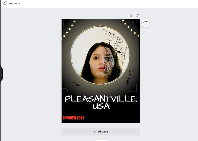
Now, on to the parts that I've added since you've last heard from me. I've made some pretty big changes, as you can see. I added the lights to the borders of the poster. I think it just gets rid of some empty space on the sides and makes it a little more three dimensional. Same with that glow that I added behind the mirror. I knew that the picture by itself was feeling static and needed some more texture. The bright glow really makes it pop while making my lighting scheme clear (which is a bonus and something that I picked up from Last Night in Soho). I was hesitant about the placement of the glow, but I feel like I centered it pretty well and that it just gives the poster more flavor. I also altered the image a little bit on Photoshop to include more cracks in the demonic side of the mirror. Now, it looks a little bit more broken and adds another layer of creepy. Same reason I added the black blood stains on the glow. I just thought that it could add a little more to the poster and give it more energy.
The only things I'm not sure about are the font for the title card and the "October 2022" text in general. To address the October text first, I don't even think it's necessary for my poster. I'm going with the digital formatting because I think my movie would be best served going to a digital streaming service after a limited release. That means I don't need credits, and it might also mean that I won't need the release date at the bottom. I could still include it, but I don't like it down there. It takes away from the rest of the poster just a little bit, which I definitely don't need. I also tried the same font but with the color blue, but it didn't match well with the poster. At least the color red indicates the thriller genre and relates to the blood stains, but doesn't do much more than that. I'll probably just delete it. That might just be the safest course of action, since I can add it again at any time or figure out something better to include.
Now, on to the thing that vexes me the most: fonts. I hate them. Well, I like them, but not when I have to choose one. When I have to choose one, there's too many and none of them are absolutely perfect, so I have to scour the entire bank of fonts (wasting minutes of my time in the process) until I find one that's halfway decent. And it's never the first one that I choose either. I always want to change it because it looks weird, or the formatting is weird. I also have to change the font size because it's always ridiculously large or small. All I'm saying is, you only have the one life. Wasting my time looking for fonts is not how I want to spend it. Well, with the rant out of the way, let's get a closer look at my title card now, shall we?

It's the Architects Daughter font, which I actually like, I'm just not sure it goes with the genre nor with my original plan. It only somewhat remind me of a white-picket fence, and it doesn't really feel intimidating or thriller-esque. What it does have going for it is the uneven letter height, which I think does add an element of suspense. It makes it seem unstable, which is good for a psychological thriller. It's the one that I'm keeping right now because I like it best, but there are a couple more options:

This font (Jeepers) definitely has the genre convention going for it. It looks like a horror or a thriller, so it would automatically clue in my target audience on what my film is about. But, I don't really like it much besides that. It looks almost a touch cliche, and is too trite. It reminds me of Ghostbusters or a Halloween greeting card (if those even exist). It also doesn't look as sharp on the poster.

This is the last one that I'm actually considering - it's called Knewave. It looks the part of the thriller convention, but it also does give me the feeling of a white-picket fence. The only thing that I'm not sure about is that it looks too plain or not distinguishable enough. I don't want to have a font that's completely boring, so this is why I chose Architects Daughter over this. It does separate itself more from the background than Jeepers, which I like, but I can't tell if it's more aesthetically pleasing on the poster than Architects Daughter.
So, this is pretty much my poster. I definitely have more work to do, but it's in its final stages. I knew that picking out the title font would be the hardest part, so I'll keep you posted on that. In other news, I have my official Instagram account for my movie, and I'll share that with all of you next blog post. This is where I sign off.


No comments:
Post a Comment